
A Good Setup for Responsive SSR React Apps
Nowadays we are tasked with building highly performant, highly responsive web applications. We rely on SSR to insure a fast 1st page load and good SEO for our apps, however one problem can sneak in when you implement your responsive components.
Let's first build a really simple next responsive app to discover the challenges that lie ahead. We can run npx create-next-app . to generate a bare-bones SSR application. We can strip out most of the stuff in pages/index.js and leave it like this:
export default function Home() {
  return (
    <main>
      <h1>Hello, World!</h1>
    </main>
  )
}
We can now add some components to simulate different mobile and desktop designs
<main>
  <h1>Hello, World!</h1>

  <h2>Mobile Design</h2>
  <h2>Desktop Design</h2>
</main>
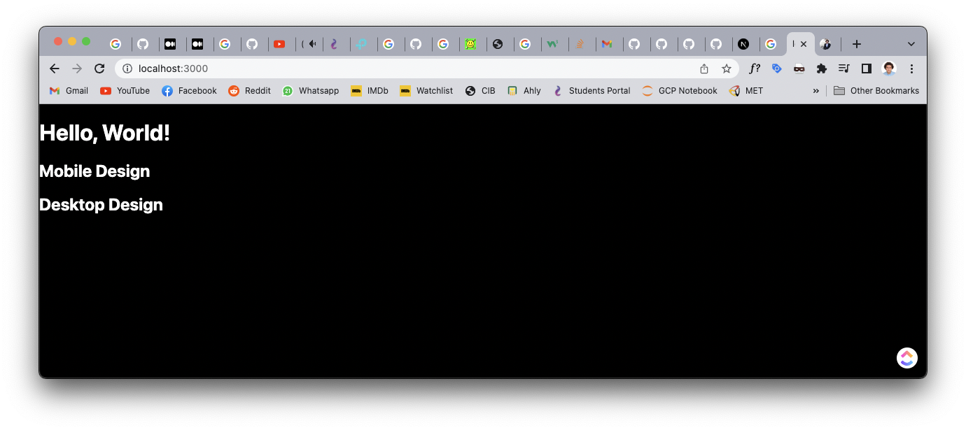
Our goal is to conditionally show these h2 tags. There are multiple approaches for this:
#1 Just some good old CSS!
We can simply just use css media queries to selectively show and hide these elements. We can use the css modules files shipped with the default next app to add some classes that achieves our goal.
@media (max-width: 768px) {
  .desktop {
    display: none;
  }
}

@media (min-width: 769px) {
  .mobile {
    display: none;
  }
}
<main>
  <h1>Hello, World!</h1>

  <h2 className="mobile">Mobile Design</h2>
  <h2 className="desktop">Desktop Design</h2>
</main>
And if we run this, it indeed works! It switches the elements precisely at 768px.
While this approach is simple and works natively, it has one simple issue. If we peek at the code sent by our server (we can do that from the network tab in our devtools, filter by Doc for clarity, and then click preview to get a look at the raw html sent), we find it clearly:
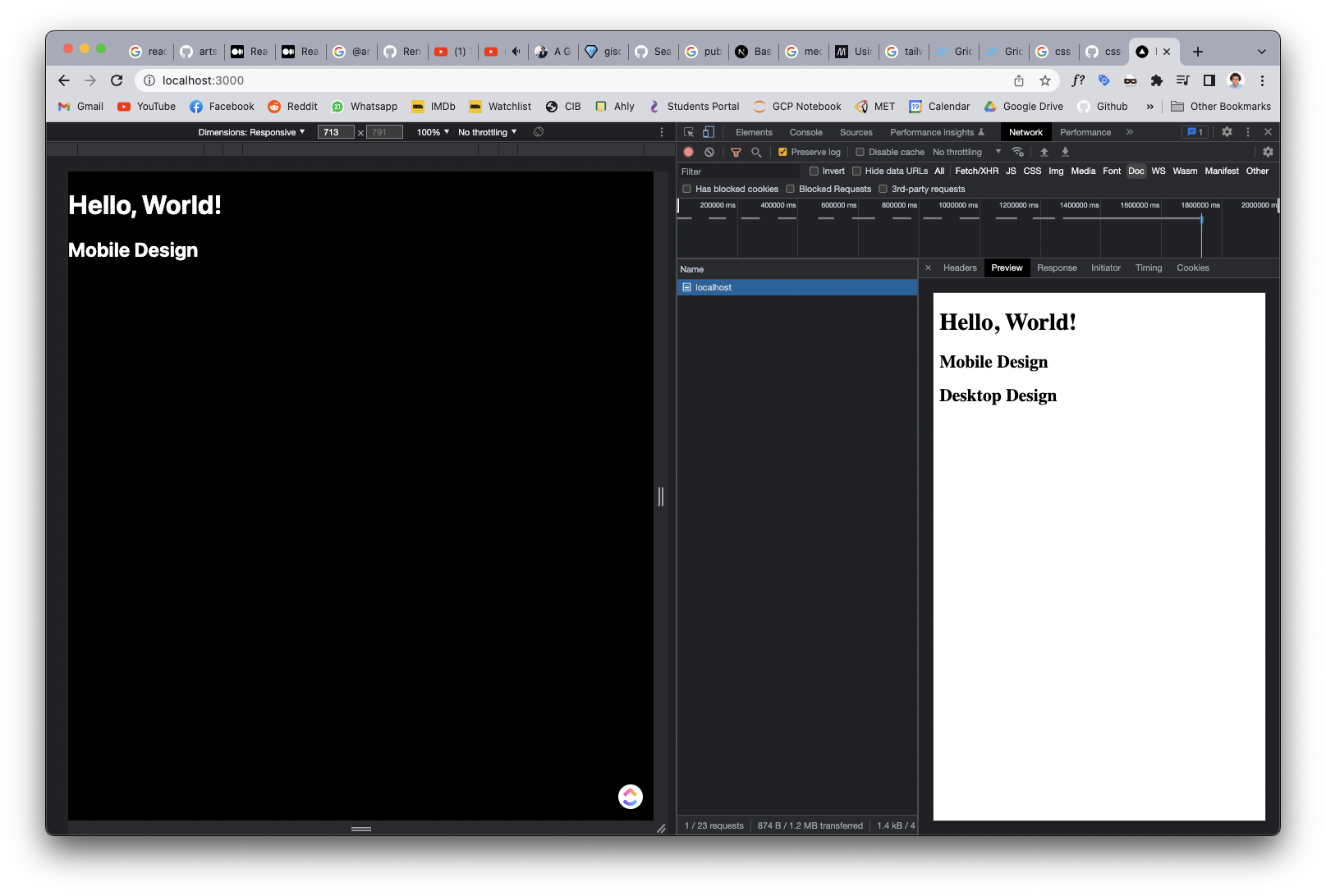
The server sends both components, and this makes sense. The React code includes both components so they will both be sent, accompanied with the css that will be evaluated by the browser and decides which one to show. Of course in this trivial example it's not an issue. But for complex web apps, where large expensive component trees will be sent over the wire and hydrated on the client, it can get quiet excessive!
If you accept this performance compromise, then this solution is perfect! Sure, it will be cumbersome to control everything with media queries and it will get annoying repeating the same component twice with different props and attaching a media query to show only one. So, we can do better!
#2 Throw JS at the issue (Using the window.matchMedia api)
Trust me, I want to avoid solving every problem I face with JS like you also, but hear me out. This api allows us to get a reactive value for a media query, and we can then consume it normally in our react code. We can write a simple react hook to set it up and use it in our page, but I prefer to use an external one since they handle a lot of edge cases (oh there is so many) which we will discuss below.
I am familiar with Mantine's hook useMediaQuery. But there is a lot of other options we can choose from. We can then define a new custom hook to detect whether this is a mobile view or not and consume it everywhere in our project.
import { useMediaQuery } from '@mantine/hooks'

export const useIsMobile = () => {
  const isMobile = useMediaQuery('(max-width: 768px)')

  return {
    isMobile,
  }
}
{
  isMobile ? <h2>Mobile Design</h2> : <h2>Desktop Design</h2>
}
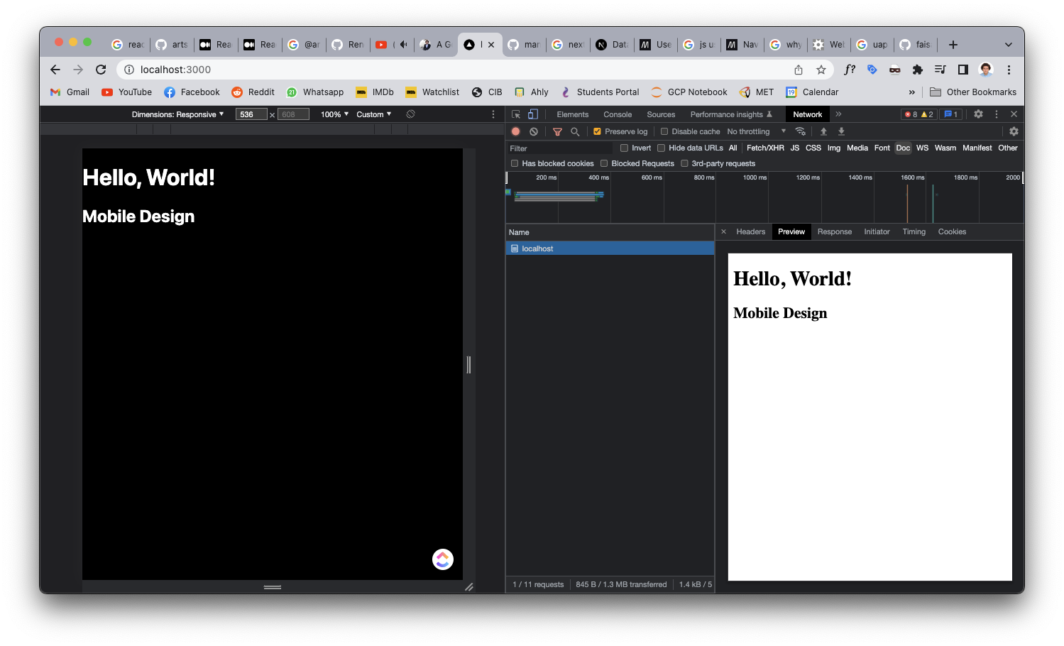
As we can see it works just as before, but we solved the previous issue! Only one component was sent over the wire. However, as you can see, the desktop component was the one that was sent, not the mobile. Why do you think that happened? This will cause a nasty effect where the UI will load the desktop version at first until the DOM rehydrates, then it will show the correct component.
I changed the styling of the desktop design to make it more noticeable. Even in this super trivial example, it is a little bit distracting. For large scale apps, like the one we are working on right now, it becomes super annoying and provides a really bad UX.
If we took a look at Mantine's source code. Other than handling weird Safari bugs and providing important React plumbing for the hook to work smoothly, it handles a very important thing which is the core of our issue.
What will the function return in the server, where it does not have access to the window object? The answer is that sadly we will never be able to know the screen width on the server. So simply, the function just accepts a second attribute initialValue that it will return if typeof window === "undefined" (essentially means we are running server side code right now).
So what do we choose for initialValue? For us, we just simply chose based on whether the majority of our users are mobile or not. Turns out that 95% of our users where on mobile, so we just simply turned initialValue to true.
So there... we solved the issue for the vast majority of our users and shipped small documents as a bonus, pretty cool right? No. We can do better.
#3 Provide a better initial value
I kept thinking about ways I can detect the screen width while I was in the server, until it dawned on me! For our purposes, we only need to know if its a mobile or not. We have a way of knowing this with a reasonable degree of accuracy, User Agents!
A user agent is just a string the browser sends in the header so the server knows some info about the client. If you take a look at your user agent (window.navigator.userAgent in your console) you will find it super confusing, and amusingly it includes the names of almost all browsers in it! Super useful of course!! This is mine right now on Chrome as an example: Mozilla/5.0 (Macintosh; Intel Mac OS X 10_15_7) AppleWebKit/537.36 (KHTML, like Gecko) Chrome/108.0.0.0 Safari/537.36 It is worth reading about the history of user agents, but it is not our topic today.
What I thought about, is we can make a reasonably guess for the user device based on their user agent, and then we can pass this value to useMediaQuery as the initialValue. We can then define a function to detect the user's device with the help of the amazing UAParser lib.
import UAParser from 'ua-parser-js'

export const isMobileDevice = (context) => {
  const useragent = context.req?.headers['user-agent']
  const parser = new UAParser(useragent)
  const device = parser.getDevice()
  return device.type === 'mobile'
}
context here is the Next object that gets passed in it's server side functions. Make sure to import this function only in server side next code, so that ua-parser-js does not get into your client bundle. Then we can consume it in our page and pass it to our hook.
import { useIsMobile } from '../hooks/useIsMobile'
import { isMobileDevice } from '../lib/detectMobile'

export async function getServerSideProps(context) {
  const userDevice = isMobileDevice(context)
  return {
    props: {
      userDevice,
    },
  }
}

export default function Home({ userDevice }) {
  const { isMobile } = useIsMobile(userDevice)
  return (
    <main>
      <h1>Hello, World!</h1>

      {isMobile ? <h2>Mobile Design</h2> : <h2>Desktop Design</h2>}
    </main>
  )
}
import { useMediaQuery } from '@mantine/hooks'

export const useIsMobile = (userDevice) => {
  const isMobile = useMediaQuery('(max-width: 768px)', userDevice)

  return {
    isMobile,
  }
}
And thats it! We now covered more than 99.9% of our users (looking at you iPad Pro users), and shipped minimal markup. Our code is very clean and functional. I call that a win!
Closing Thoughts
There is some more complicated solutions I did not cover here, like: @artsy/fresnel. Be ware it is not compatible with React 18.
I would recommend approach 1 for most people as it was the most simple one that just works without having to rely on JS or user agents or do some guessing work. It is native and it just works. But if you want optimize more, and/or maybe you actually want to consume a reactive value in your JS, I think we found a pretty good solution.
I think the use case of combining a window.matchMedia JS approach accompanied with providing an initial value based on the user agent provides a super robust way to rended a modern responsive SSR app.